Oeneis chryxus ivallda (Ivallda Arctic)
Visual overview of genome assembly metrics
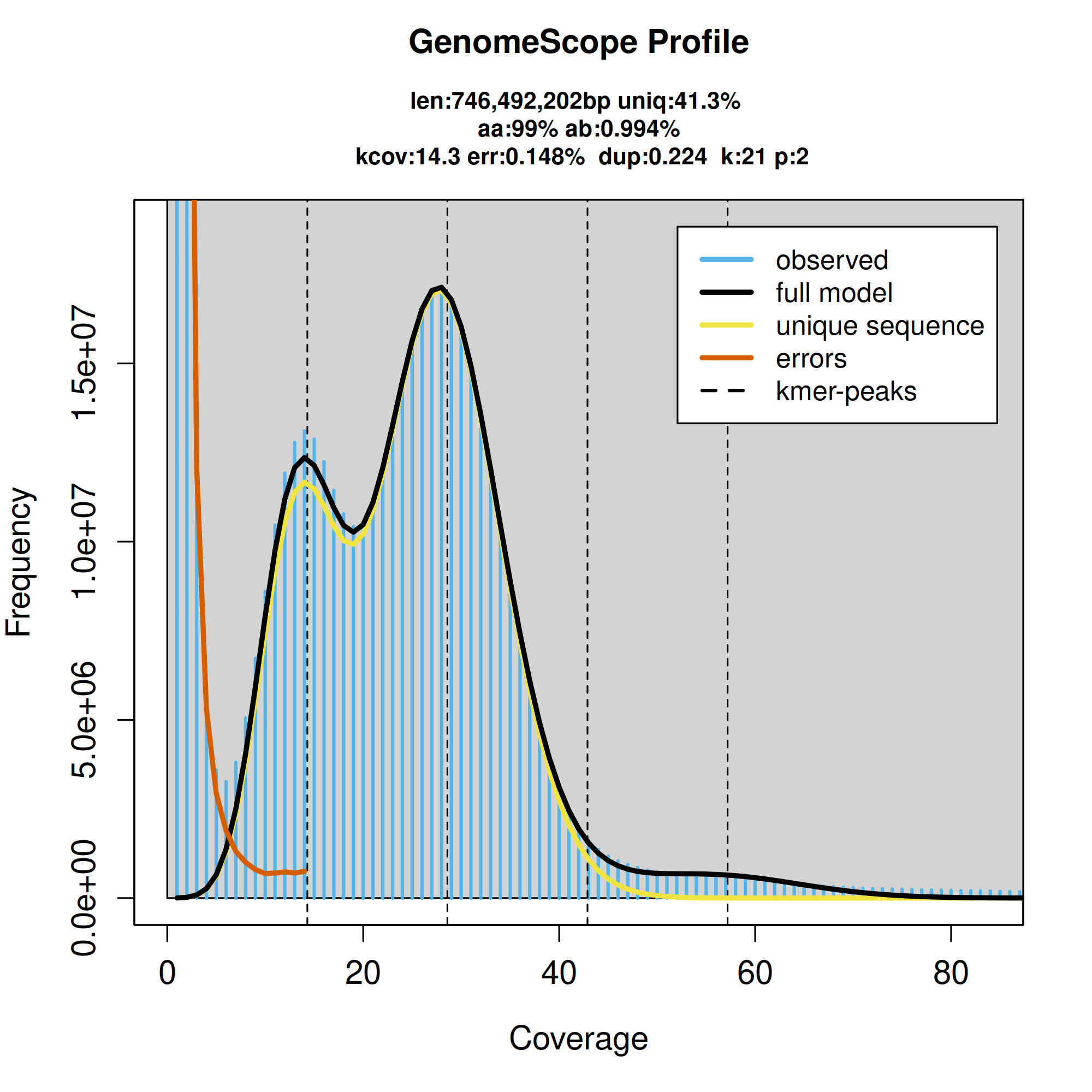
K-mer spectra output generated from PacBio HiFi data without adapters using GenomeScope2.0.
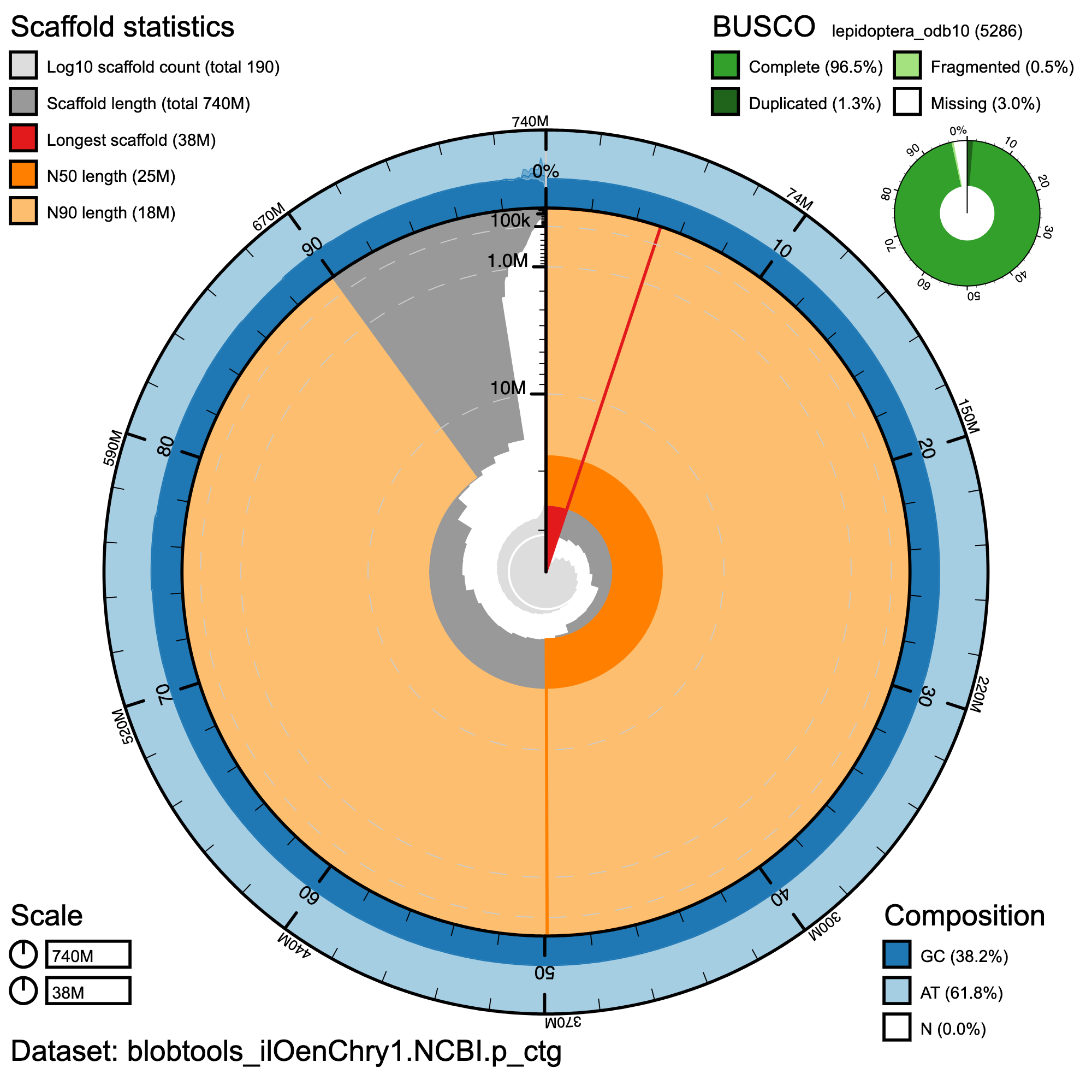
BlobToolKit Snail Plot showing a graphical representation of the quality metrics presented for Haplotype 1. The plot circle represents the full size of the haplotype. From the inside to the outside, the central plot covers length-related metrics. The first (red) line represents the size of the longest scaffold; all other scaffolds are arranged in size order moving clockwise around the plot and drawn in gray starting from the outside of the central plot. Dark and light orange arcs show the scaffold N50 and scaffold N90 values. The central light gray spiral shows the cumulative scaffold count with a white line at each order of magnitude. White regions in this area reflect the proportion of Ns in the assembly. The dark vs. light (blue) area around it shows mean, maximum and minimum GC versus AT content at 0.1% intervals.
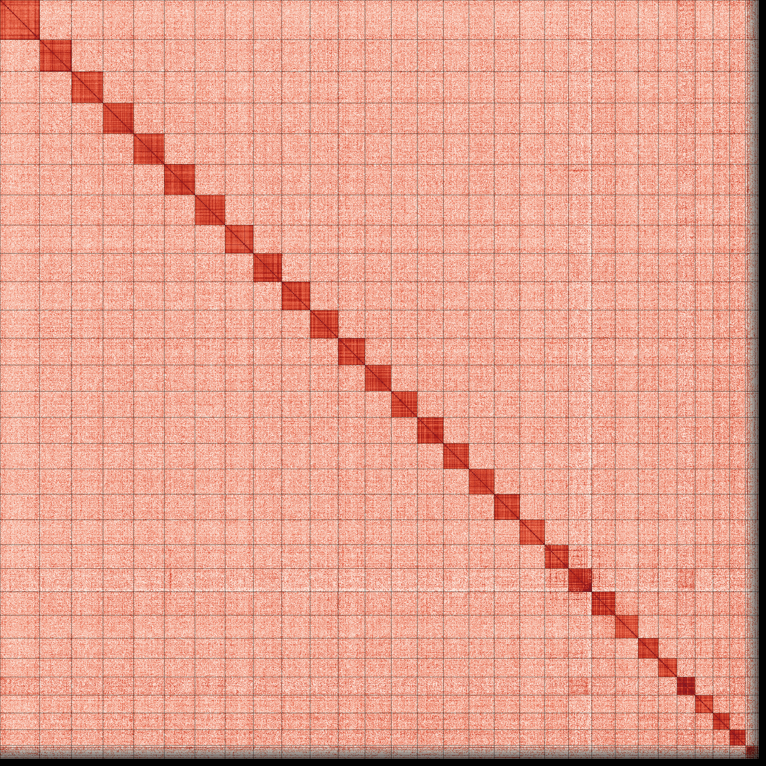
An Omni-C Contact map for Haplotype 1 generated with PretextSnapshot. This contact map translates proximity of genomic regions in 3-D space to contiguous linear organization. Each cell in the contact map corresponds to sequencing data supporting the linkage (or join) between two of such regions. Scaffolds are separated by black lines and higher density corresponds to higher levels of fragmentation. Due to the high contiguity of this assembly, we infer that many of these scaffolds represent full chromosomes.
Authors
Zachary G MacDonald, Sean Schoville, Merly Escalona, Mohan P A Marimuthu, Oanh Nguyen, Noravit Chumchim, Colin W Fairbairn, William Seligmann, Erin Toffelmier, Thomas Gillespie, H Bradley Shaffer